How can you tell if a social service, for example, an employment service for people with disabilities, or a community-based social service for older people, is 'good'?
Of course, to answer this you need two things:
1. a clear definition of what 'good' means
2. data that shows quantified performance against this definition.
What Does ‘Good’ Look Like?
I was undertaking a review of a community service recently: the service runs a number of different programs. I took the opportunity to ask the respective program coordinators how they thought their programs had been performing: did they think their programs were 'good'?
It was fascinating to see how the coordinators, who all ran similar programs, answered the question. Some answered in terms of their increased confidence, stemming from greater training. Others pointed to greater service professionalism reflected in things such as policies and procedures and the administrative facets of the service. Yet others answered in terms of the numbers of clients and their length of association with the program. Still others saw things in terms of the number and length of service of their volunteers.
All of those responses are valid; it would be hard to argue with any of them. Yet none of them has a claim to being the ultimate definition of performance, which is always up for grabs.
So the performance of social services is intimately linked with how you define performance.
Instead of 'What you see is what you get' (WYSIWYG) it's a case of 'What you define is what you see' (WYDIWYS).
Any data analysis has to flow from there. Analysing data without first properly defining what's being measured will lead to reams of unintelligible data – thick reports containing a jungle of numbers – which can't be navigated and cause more confusion than clarity.
Incarnating Reality
But that's only one aspect. Some dimensions of performance simply cannot be directly observed – they only become apparent by understanding the big picture, and his has to happen through collecting and analysing data.
This is best explained by one of the major proponents of analysis-based measures of baseball in the United States:
… the naked eye was an inadequate tool for learning what you needed to know to evaluate baseball players and baseball games. Think about it. One absolutely cannot tell, by watching, the difference between a .300 hitter and a .275 hitter. The difference is one hit every two weeks.… if you see both 15 games a year, there is a 40 percent chance that the .275 hitter will have more hits than the .300 hitter.… The difference between a good hitter and an average hitter is simply not visible – it is a matter of record.
Moneyball by Michael Lewis, p.68
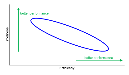
Another example: in October I analysed the performance of 31 Sydney councils in processing development applications (DAs) comparing their timeliness with their efficiency. Without looking at the data, you would have expected a trade-off between timeliness and efficiency: that the fastest councils 'bought' their timeliness at the expense of efficiency by putting on more staff to churn through the DAs. Plotting this graphically you would expect to see a pattern where better timeliness was associated with worse efficiency, and vice versa, like this:
What the data for 2012/13 actually shows, where each dot represents a council, is this:
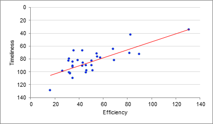
source: ‘Is Faster Better? The Performance of Sydney Metropolitan Councils in Processing DAs’, Research Brief, Michael Carman Consulting, October 2014, p. 5.
In other words, we see the exact opposite of what we would expect: an increase in efficiency is associated with an increase in timeliness. A bit of investigationrevealed that the top performing council (Warringah) includes Tree Preservation Orders (which are quick and uncomplicated) as DAs, and they have a wide-ranging business improvement regime in place. Click here to read the research report, and click here to see the Sydney Morning Herald’s write-up of it.
The point is that going through a process of thinking through what constitutes performance, and then analysing the data to support or refute your views about how you actually did perform, enables you to crystallise the reality about your organisation.
The notion of making the unformed tangible, appropriate at Christmas (an occasion centring on incarnation), stands in contrast to the usual nebulousness in which many organisations operate. Clarity has to be fought for: it does not emerge by itself. It has to be sculpted.
That’s a good thing to bear in mind as we wrap up this year, and start to prepare for next. I encourage you to spare a thought for whether your organisation has sufficient clarity in how it defines performance, and whether that performance is objectively and consistently measured. And then acted upon.
I’m sure the community service coordinators I spoke to would agree.
* * *
This has been a demanding year for many. Against the background of present uncertainties, I hope your festive season is peaceful and enjoyable, and that you emerge from it refreshed and with a renewed sense of purpose.
Kind regards,
Michael Carman
Director I Michael Carman Consulting
PO Box 686, Petersham NSW 2049 I M: 0414 383 374 I
Reference: Moneyball by Michael Lewis, WW Norton & Company 2004.
© Michael Carman 2014