DON'T JUST READ THE DASHBOARD ... DRIVE THE CAR!
My son just returned from a trip to Europe.
He had visited the Louvre, and I asked him whether he saw the Mona Lisa. He replied that he had, and that everyone who was at the painting faced away from it … so that they could take a selfie of themselves with it.
Call me old-fashioned, but back in my day, when you looked at a work of art, you faced it directly so that you could in fact, actually see it, rather than facing 180 degrees away.
Clearly for most people it’s more important to show you saw a piece of art, rather than to actually look at it and draw out its meaning for you.
I don’t think Leonardo would be too impressed.
The Curse of Superficiality
This same superficial, purely symbolic treatment seems to pervade far less high-brow concerns such as Key Performance Indicator (KPI) dashboards and scorecards: we produce them and note that they’re there, but don’t actually take the time to understand what they’re saying to us.
To regale you with yet another true (unfortunately) story, some IT staff from a private sector company told me earlier this year that they had been asked to produce a dashboard. When they asked the executive concerned what he wanted on the dashboard, the reply came back: “I don’t know; I just want a dashboard.”
Now, perhaps your correspondent is just having a bad day. But I rail at this hopelessly superficial treatment. It’s not worthy of senior management (any more than the treatment being visited upon the Mona Lisa befits her) and it reeks of what philosophically is referred to as formalism: the triumph of pure form at the expense of substance and content. This must lead to mistakes because without understanding how to manage a business or organisation the organisation will be left to the forces of whim and caprice.
What Does it Take to Make a Dashboard Useful?
So, how should it look?
I maintain that the indicators chosen for a dashboard or reporting scorecard should reflect the goals of the division or organisation, capturing both the outcomes, and the levers pushed or pulled to achieve those outcomes.
There are two critical aspects here: the choice of the KPIs/indicators themselves, and the relationship between these various indicators. Together, these reflect a cogent understanding of the organisation and how it functions.
An Example: Hospital Emergency Department Waiting Times
Here’s a real-life example from the public health sector.
Hospitals measure how many of their total beds are being utilised: the bed occupancy rate (a KPI). While they will typically aim to have a high bed occupancy rate (they don’t want beds sitting idle) if too many are being used beds won’t be available for use by emergency departments (EDs), and emergency waiting times (another KPI) will increase. So there is a trade-off between bed occupancy and ED waiting times.
We can extend the logic: shorter ED waiting times could reflect lower quality care as patients are discharged prematurely, but subsequently have to be re-admitted to the same ED because they only received cursory treatment the first time around.
These are sound hypotheses, and it makes sense to manage hospital operations accordingly. A hospital can make a decision to, say, send patients home earlier and reduce bed occupancy so that more beds are free to accommodate emergency patients, hence reducing ED waiting times.
But we can push things further: we can quantify if these relationships actually exist and if so, to what extent.
In fact, I have. The Audit Office of NSW publishes statistics each year in their financial audit reports, and I have extracted and analysed that data for each of the 12 non-rural local area health districts (South East Sydney, Western Sydney, Illawarra, etc.) for 2016. Here’s what I found:
• there is indeed a relationship between bed occupancy and ED waiting times: every one percentage point increase in bed occupancy is associated with a 0.5 percentage point decline in the proportion of ED patients treated within four hours (in other words, more emergency patients have to wait longer)
• every percentage point increase in emergency patients treated in four hours is associated with a 0.08 percentage point increase in ED patients re-presenting to the same ED.
The first result is statistically significant at better than 15 per cent, while the second is statistically significant at better than five per cent. In other words, these are real relationships and not just ‘flukes’.
You can see where this is heading. By analysing the relationships between KPIs, we can manage our organisations with greater intentionality. Rather than just reading dashboard gauges, we can drive the car.
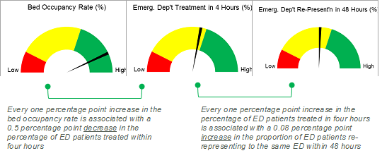
[Note: dashboard graphics are indicative only, and do not reflect the results of analysis]
Different Sectors, Same Principle
The same approach can be applied in other areas.
In business, operations can be linked financial indicators. A manufacturer for example, can gauge the impact of an increase in plant size on unit costs.
And a not-for-profit organisation can estimate how many supporters they need to generate a particular number of volunteers or donors.
The principle is clear: by analysing the relationships between indicators we can thread them together into a coherent performance story, and that enables us as managers to improve results.
It might not be as great as the Mona Lisa’s smile … but at least we’ll be facing in the right direction …
* * *
We’ve seen some startling developments on the global front this year, many of them aimed at isolation and contraction, and not driven by particularly noble motives.
The challenge, of course, is not to respond in kind, but to rise above that which is less-than-impressive, to speak to the higher self. In this light, I like what author Thaddeus Golas says about expansion and contraction, as cited by Michael Gerber:
We experience expansion as awareness, comprehension, understanding, or whatever we wish to call it. …
On the other hand, when a (human) being is totally contracted, he is a mass particle, completely imploded. To the degree that he is contracted, a being is unable to be in the same space with others, so contraction is felt as fear, pain, unconsciousness, ignorance, hatred, evil, and a whole host of strange feelings.
As the year draws to a close, my wish for you is that the festive season brings relaxation and replenishment, and the New Year an expansion in understanding and comprehension … and the widened sense of possibility that accompanies it.
Warm regards,
Michael
Director I Michael Carman Consulting
PO Box 686, Petersham NSW 2049 I M: 0414 383 374
References:
Gerber, Michael E., (2003) The E-Myth Contractor HarperBusiness, p.85.
New South Wales Audit Office (2016) Financial Audit: Volume 11 – Report on Health.
© Michael Carman 2016